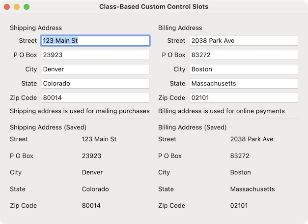
Glimmer DSL for LibUI (Prerequisite-Free Ruby Desktop Development Cross-Platform Native GUI Library) version 0.12.0 ships with an exciting new feature called Custom Control Component Slots!!! Component Slots are containers that could accept content in different parts of a Custom Control component (e.g. an address_form Custom Control can have a header slot and a footer slot to display extra information about the address being entered, which consumers could fill in with any GUI controls). A new example has been implemented to demonstrate this feature: Class-Based Custom Control Slots.
Of course, Glimmer implements Component Slots with the simplest most declarative DSL syntax possible (as with all features of Glimmer), which does not require redundant declarations of slots in advance or a distinction between singular and plural slots, yet all slots are treated uniformly in the simplest way possible. In the past, if you opened a block in front of a Custom Control keyword and shoved content in it (e.g. `address_form { label('some text') }`), it got added to the bottom inside the Custom Control's top-level control (though there was a bug in that feature that was fixed in version 0.11.10). That was a good smart default as it allowed contributing Custom Control content by consumers without having to explicitly/manually specify where to insert `children` in the Custom Control. Glimmer just knew what to do by default. That said, it did not address all needs, like wanting to insert content in arbitrary places deep in a Custom Control's body hierarchy. Now, Software Engineers could allow consumers of Custom Controls to contribute content everywhere inside a Custom Control, not just inside the top-level control, with a very minimalistic declarative DSL syntax that greatly facilitates building highly customizable Custom Controls.
I leave you with the Custom Control Component Slots feature documentation below.
Glimmer on!!!
P.S. In other news, somebody built Go in Ruby using Glimmer DSL for LibUI.

No comments:
Post a Comment