New Custom Shape Gems have been published for Glimmer DSL for SWT:
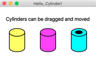
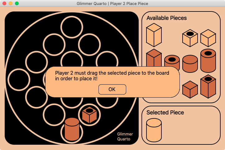
- glimmer-cp-cylinder: an upright `cylinder` custom shape composite of simpler shapes
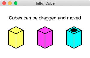
- glimmer-cp-cube: an upright `cube` custom shape composite of simpler shapes
- glimmer-cp-messageboxpanel: a customizable graphical `message_box_panel` that is an alternative to the native SWT `message_box`

% glimmer list:gems:customshape
Glimmer Custom Shape Gems at rubygems.org:
Name Gem Version Author Description
Bevel glimmer-cp-bevel 0.1.1 Andy Maleh Bevel - Glimmer Custom Shape
Cube glimmer-cp-cube 0.1.0 Andy Maleh Cube - Glimmer Custom Shape
Cylinder glimmer-cp-cylinder 0.1.0 Andy Maleh Cylinder - Glimmer Custom Shape
Messageboxpanel glimmer-cp-messageboxpanel 0.1.0 Andy Maleh Message Box Panel - Glimmer Custom Shape
Stickfigure glimmer-cp-stickfigure 0.1.1 Andy Maleh Stick Figure - Glimmer Custom Shape
No comments:
Post a Comment